CASE STUDY:
VITAME




SCROLL
PROJECT DETAILS
Vitame is a cold-pressed juice brand inspired by the power of nature. Using fresh, nutrient-rich ingredients, Vitame creates energizing juices crafted to bring health, flavour, and vitality to your daily routine.
For this project, I designed a bold, minimalist brand identity that celebrates the freshness and vitality of the brand's cold-pressed juices. The visual direction leans into clean lines, simple forms, and vibrant colour — reflecting the brand’s commitment to natural ingredients, energy, and purity.
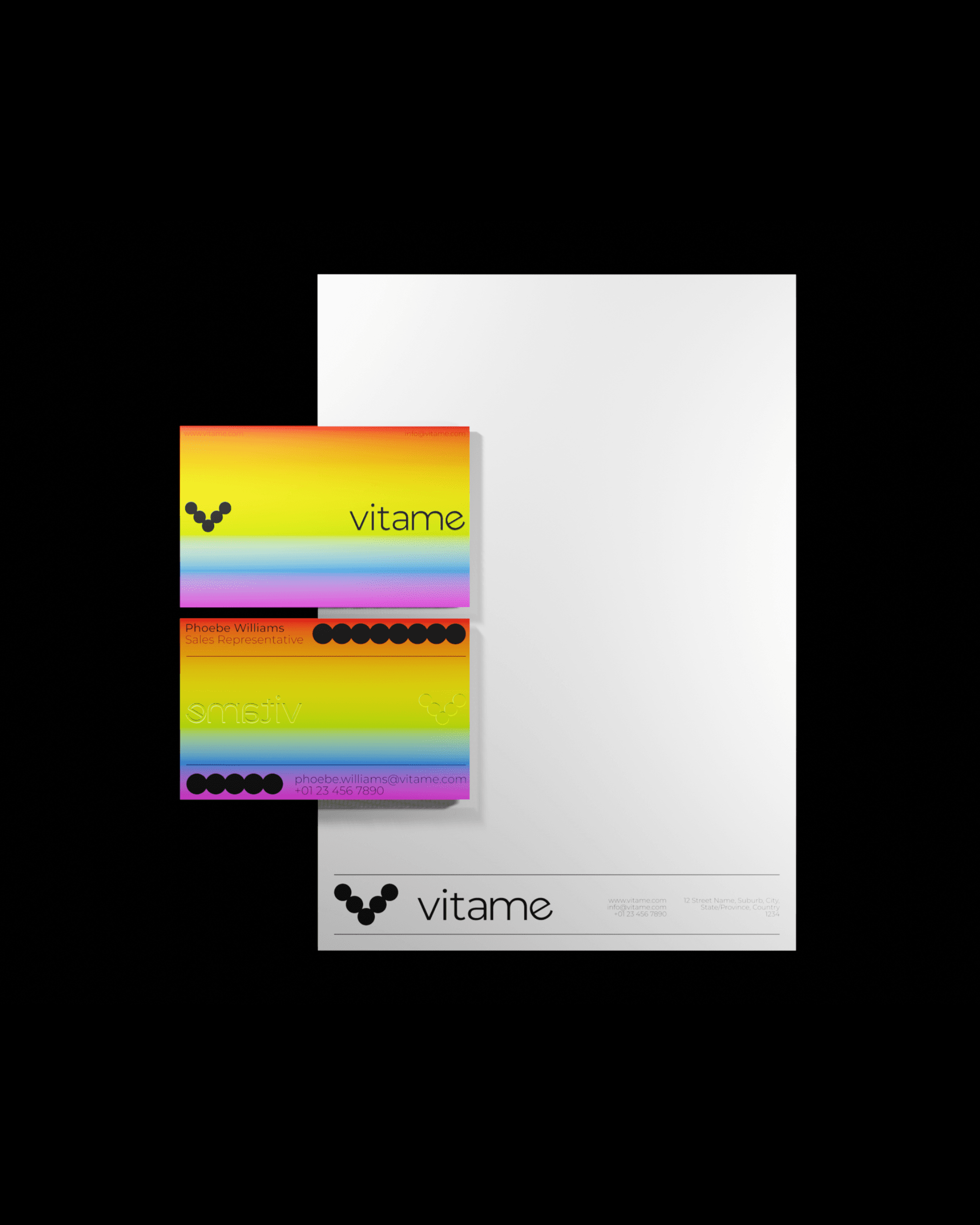
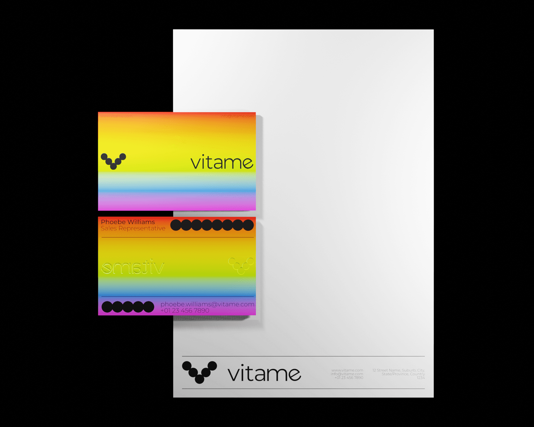
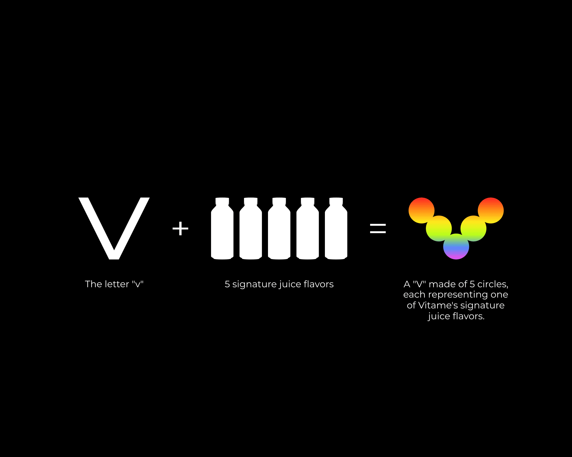
At the core of the identity is a distinctive logo built from five circular forms that come together to create a bold “V” — a direct reference to the Vitame name and its five signature juice flavours. The use of geometric shapes reinforces the idea of simplicity and clarity, while creating a strong, memorable visual mark.
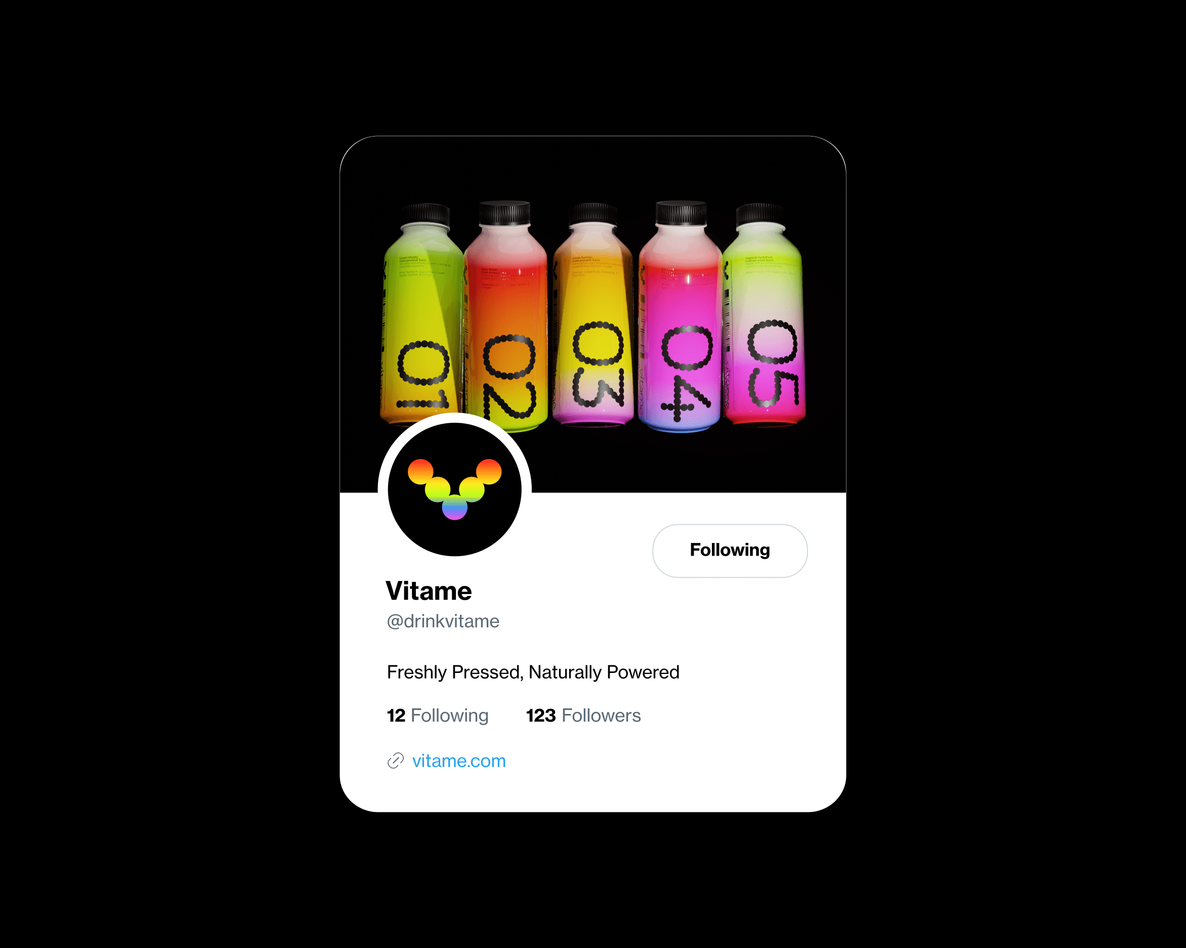
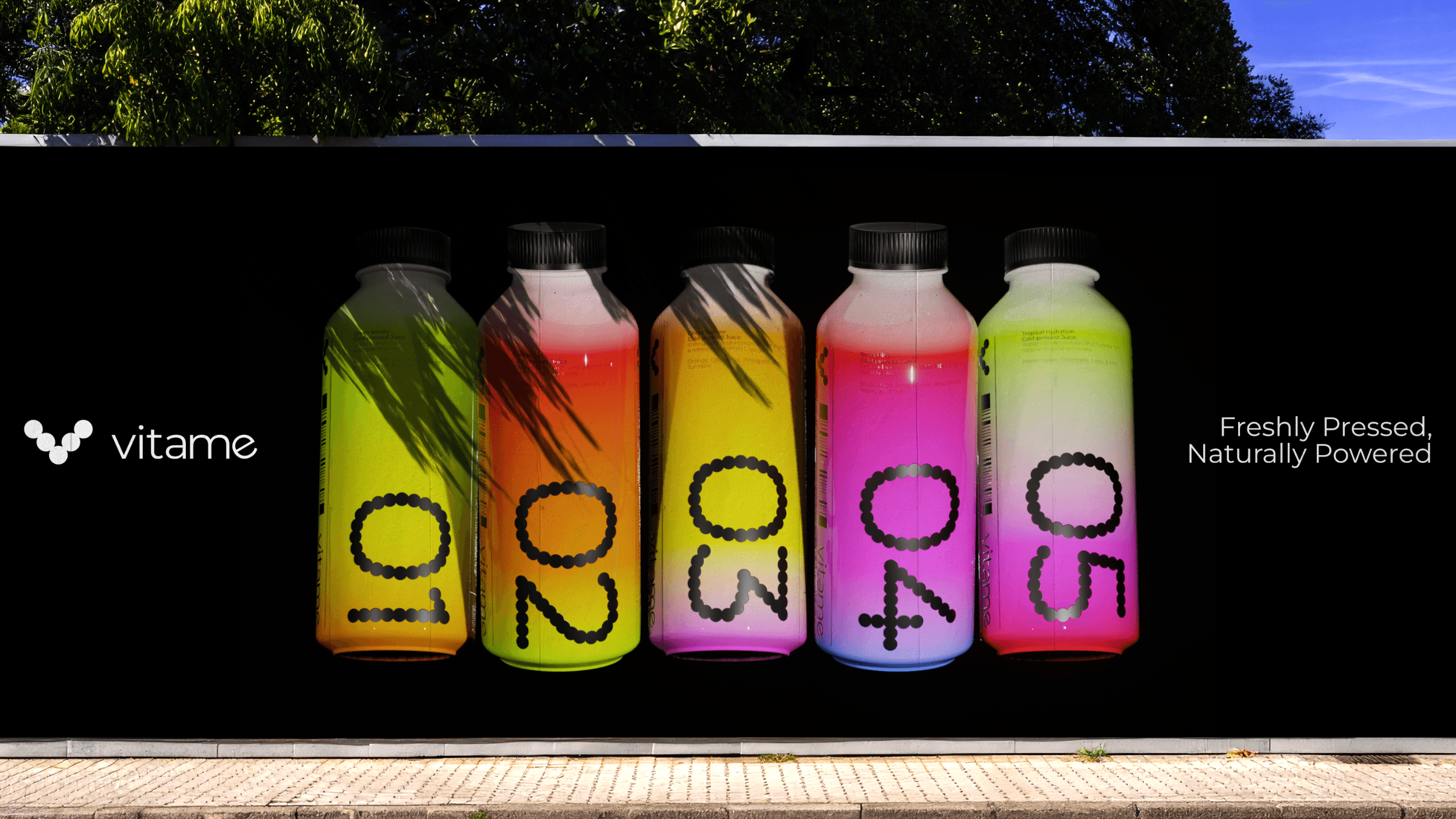
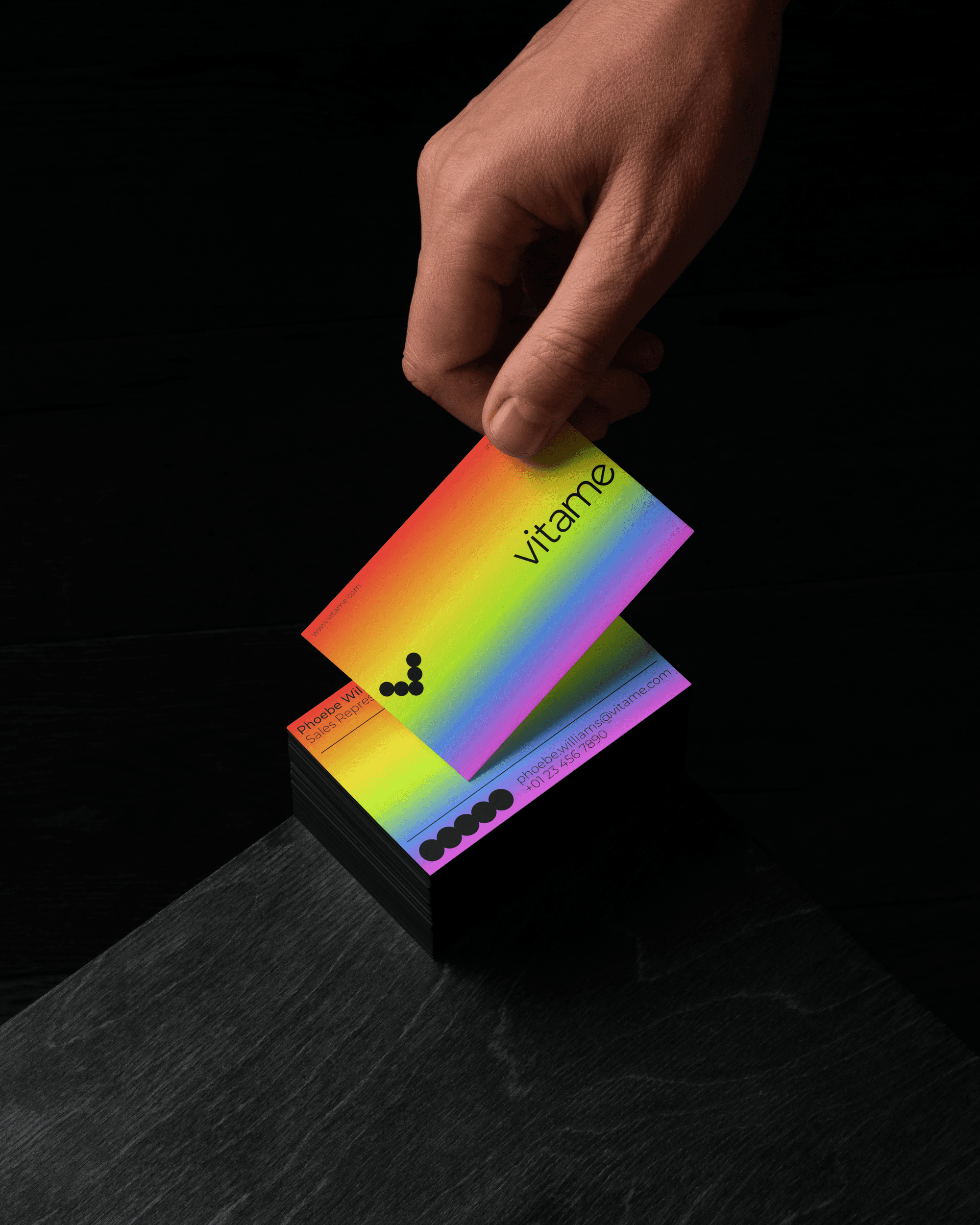
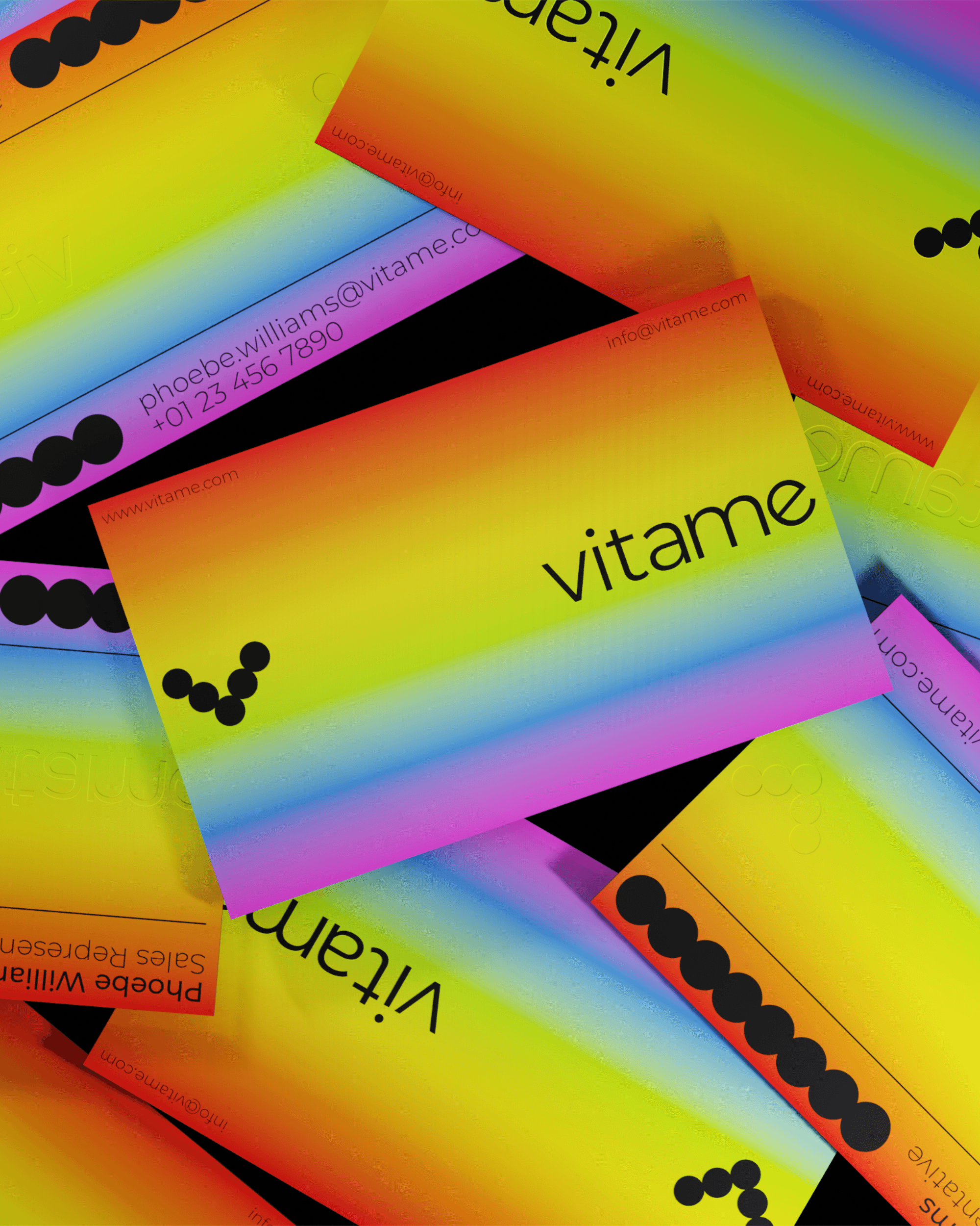
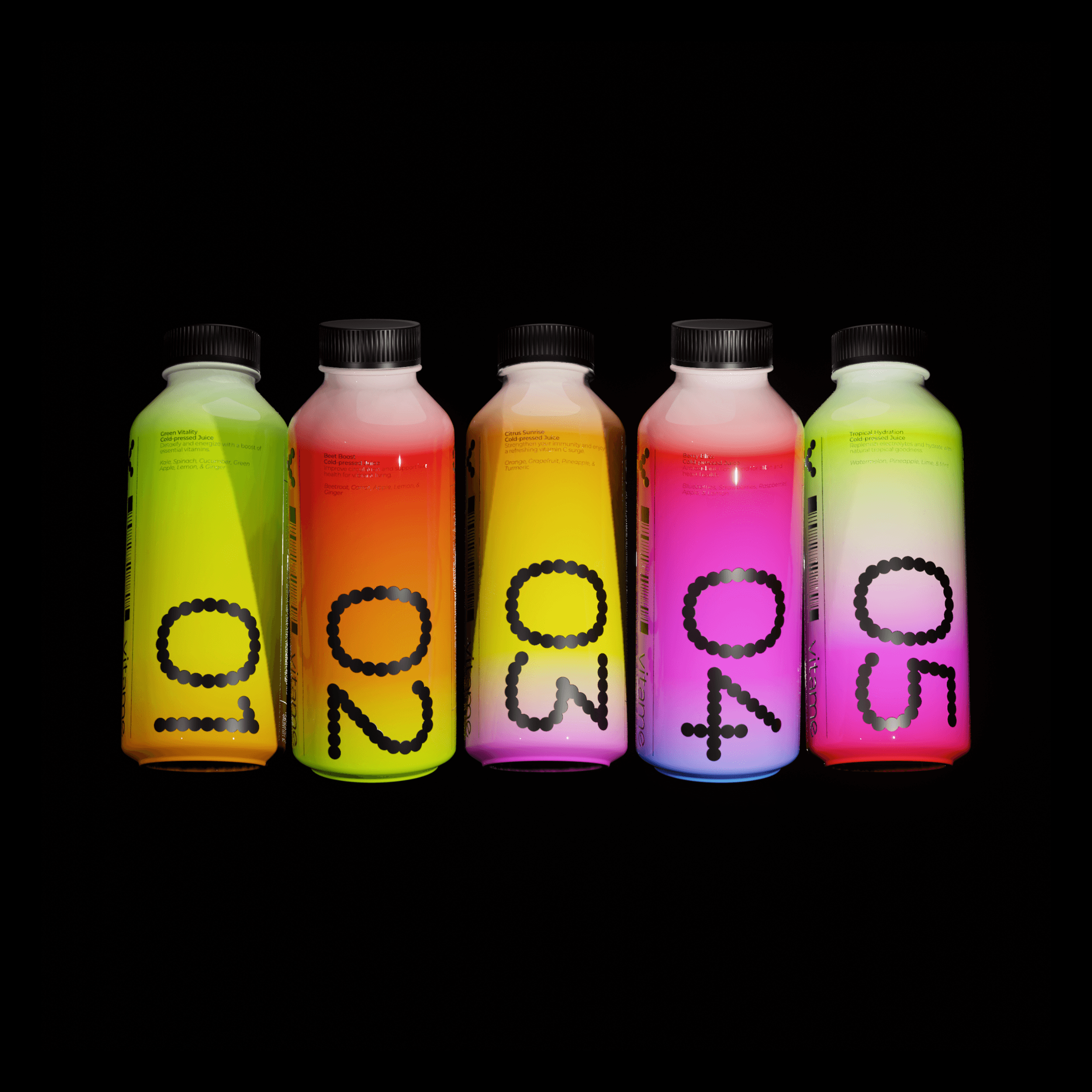
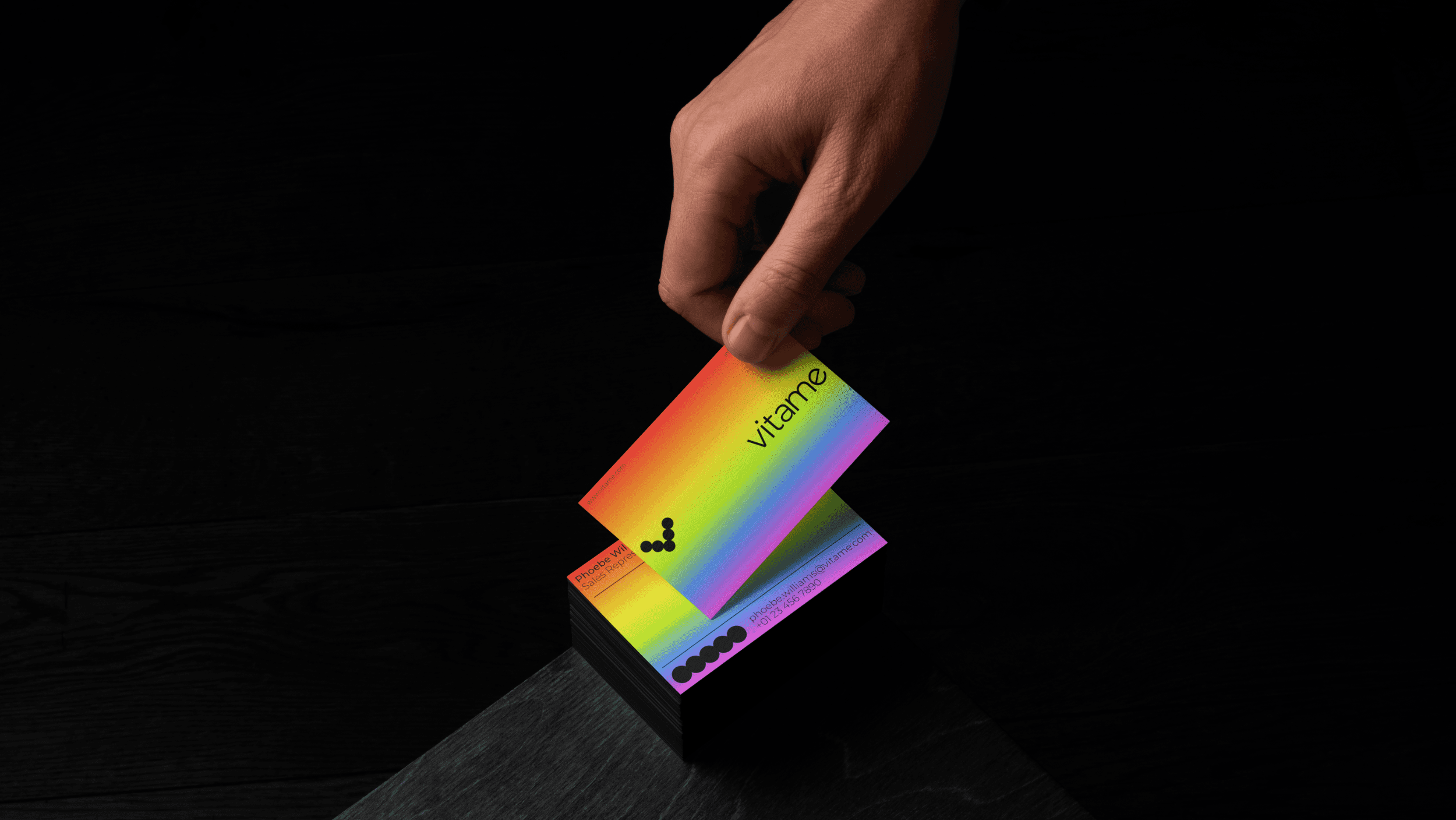
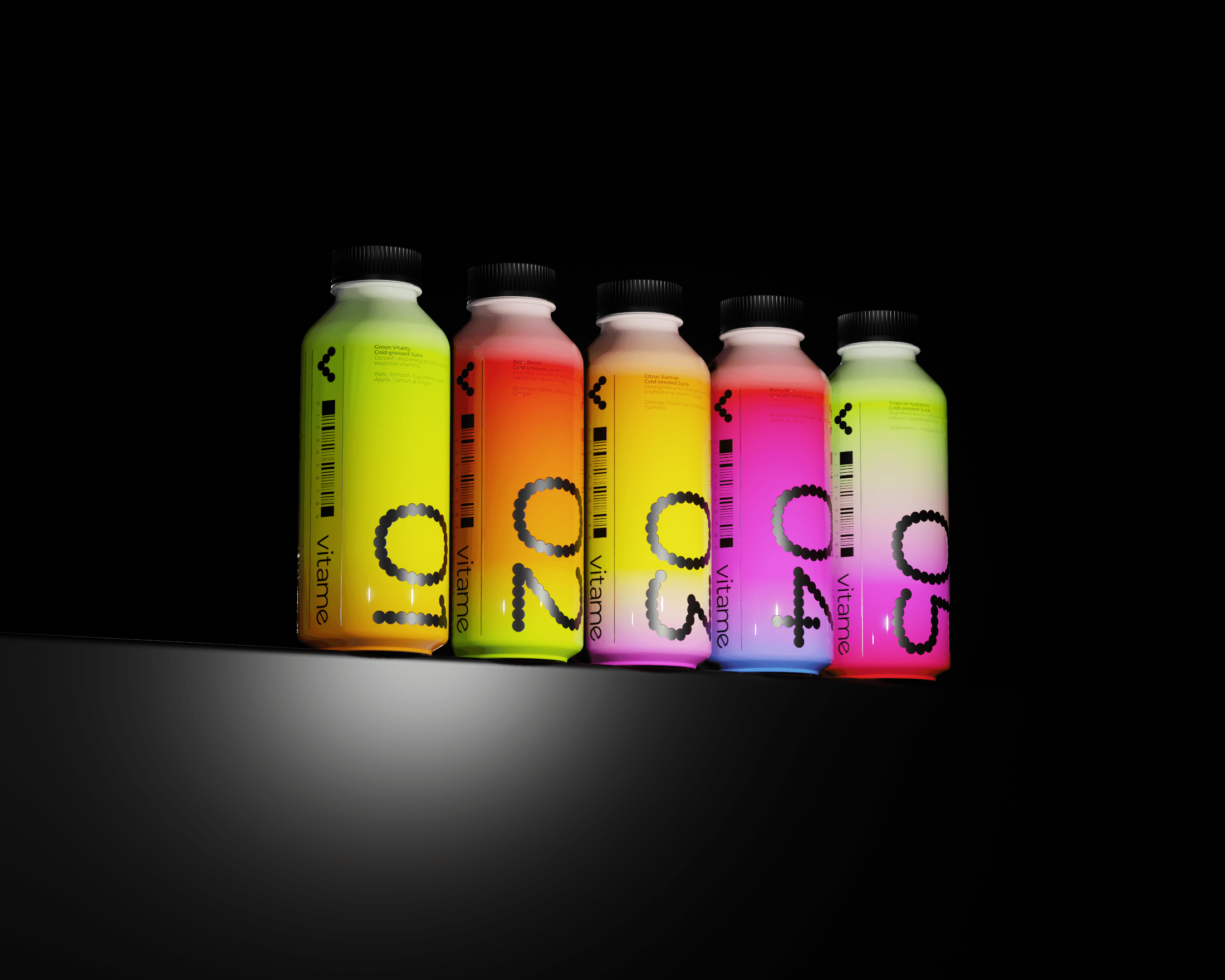
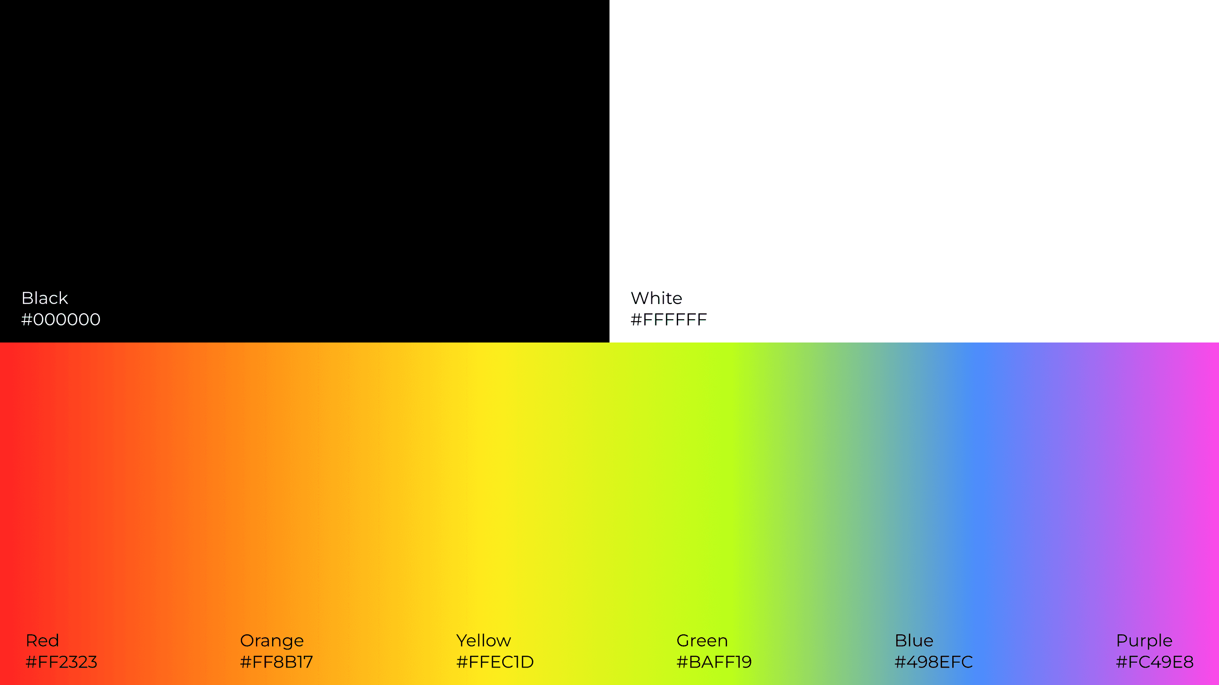
The brand palette pairs a stark black-and-white foundation with a spectrum of bright, high-energy colors inspired by fresh fruits and vegetables. These colors are used in smooth gradients that wrap around packaging and graphics, bringing a sense of movement, flavor, and vitality to the brand.
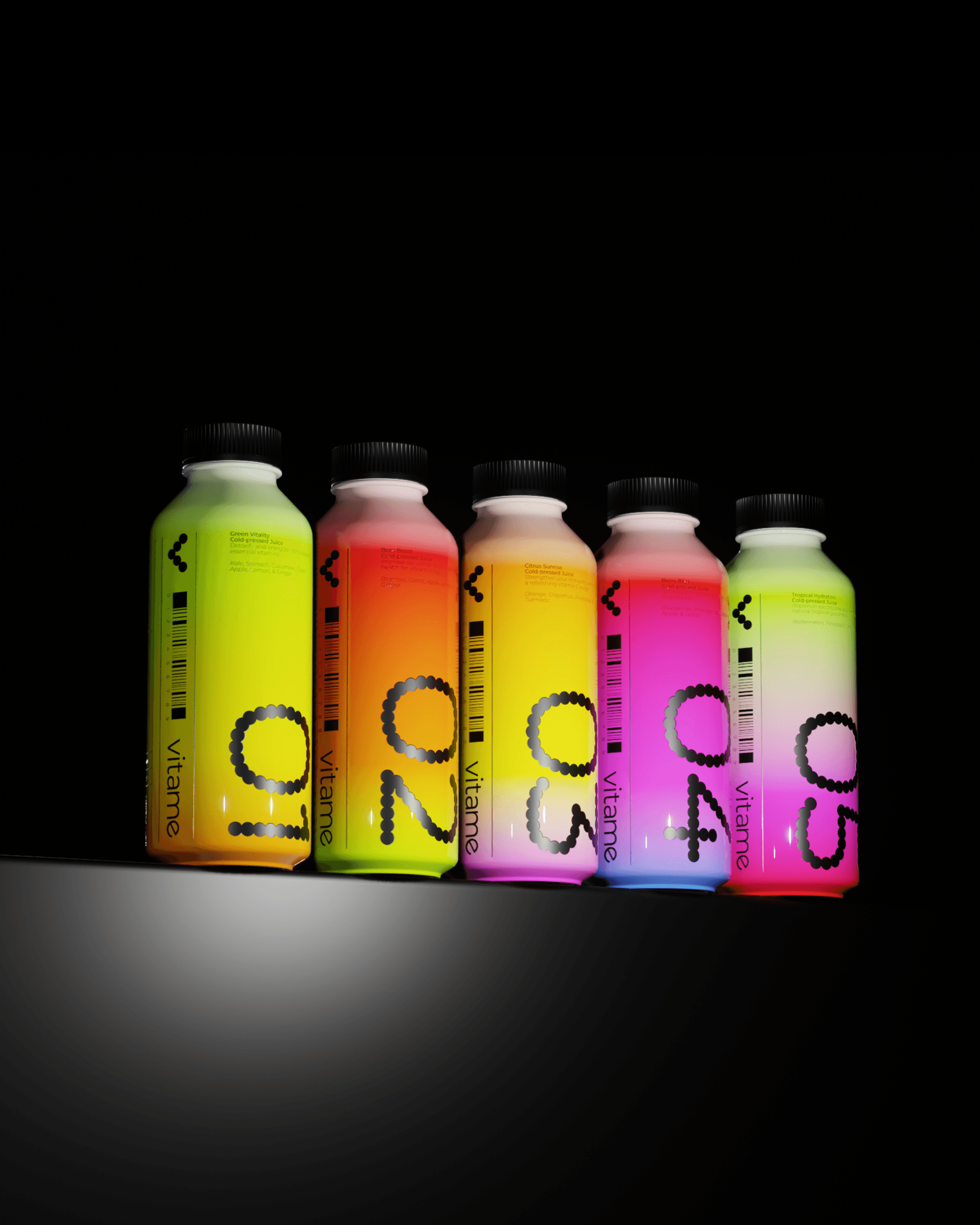
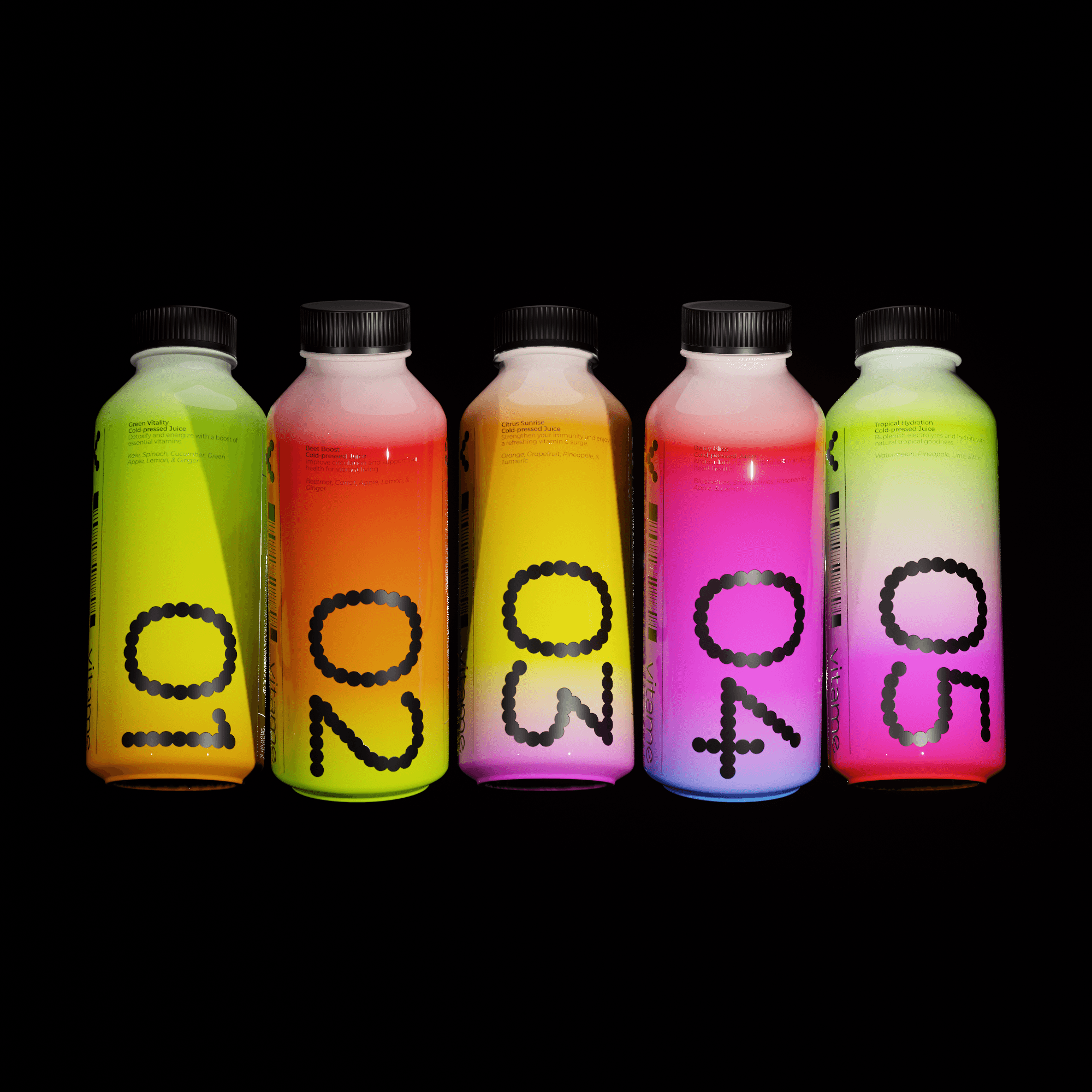
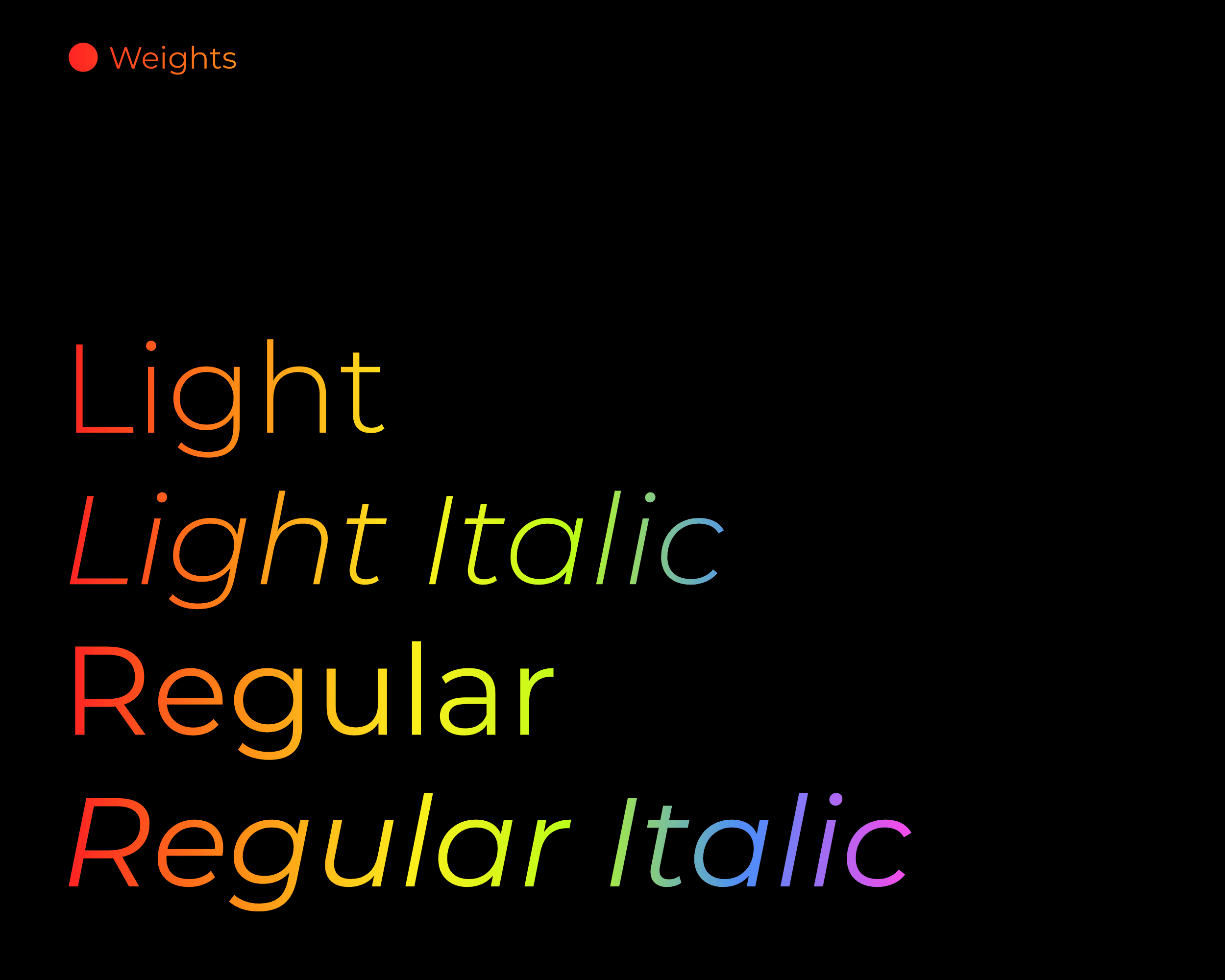
Typography is kept clean and modern, supporting the minimalist aesthetic while ensuring clarity and consistency across applications. The packaging design extends the visual identity through sleek bottles and flavor-specific gradients, creating an intuitive connection between each juice and its ingredients.
This project showcases a cohesive visual system that balances simplicity with impact — resulting in a fresh, energetic brand that feels modern, confident, and alive.
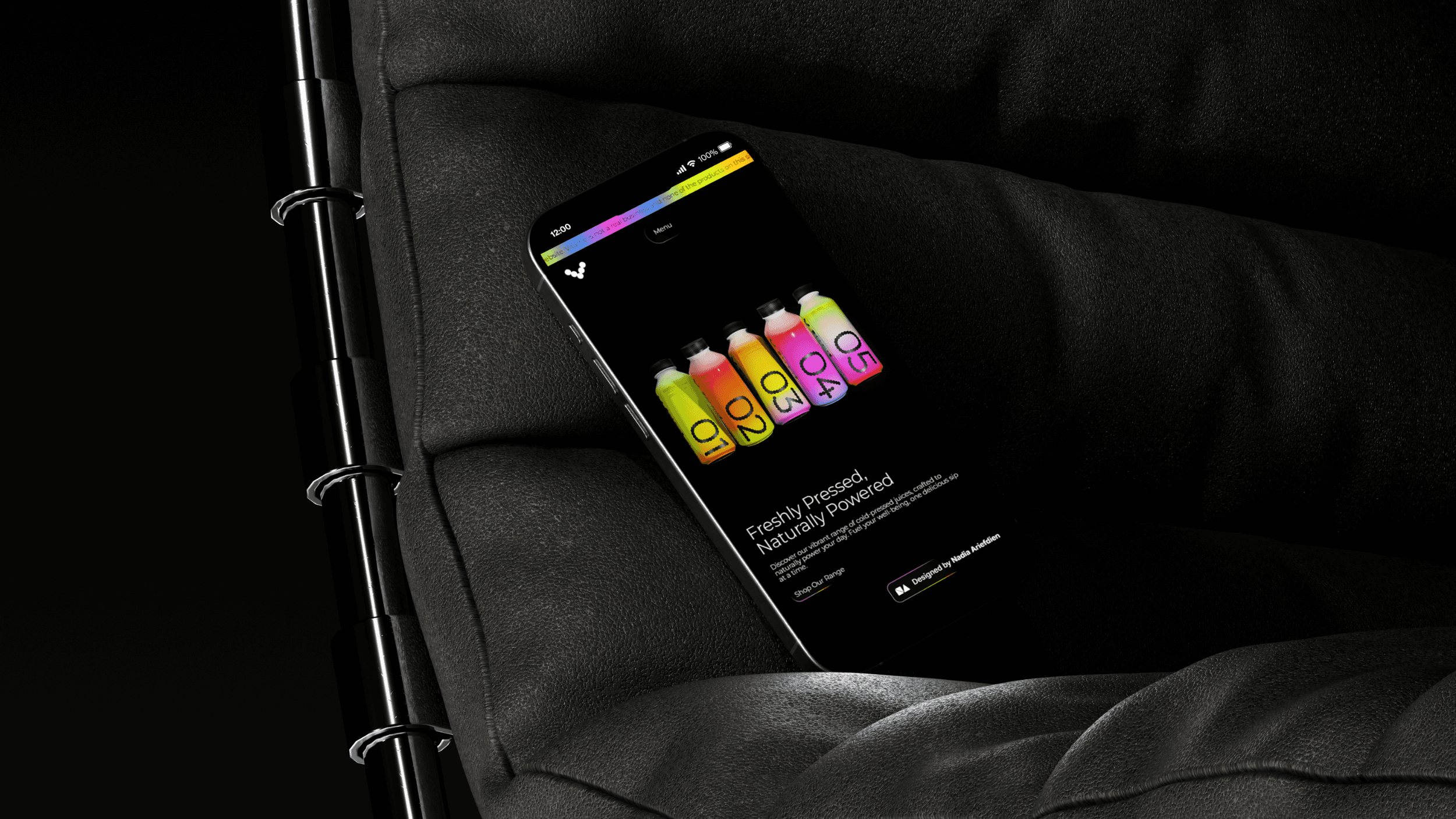
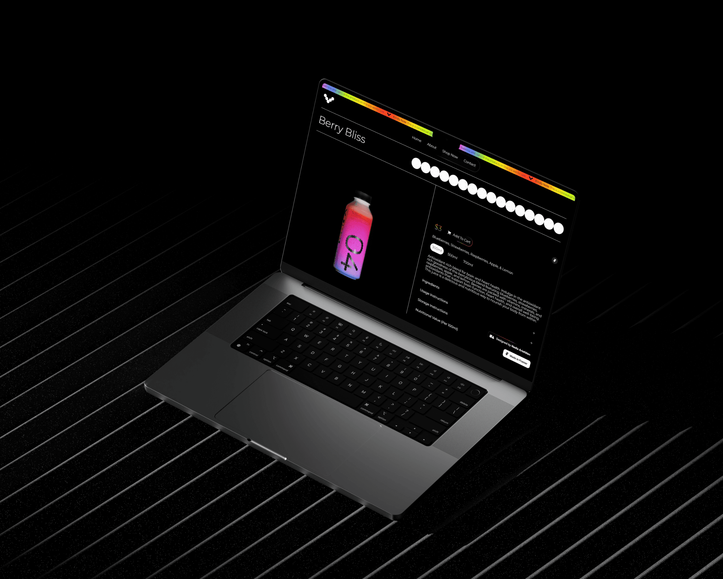
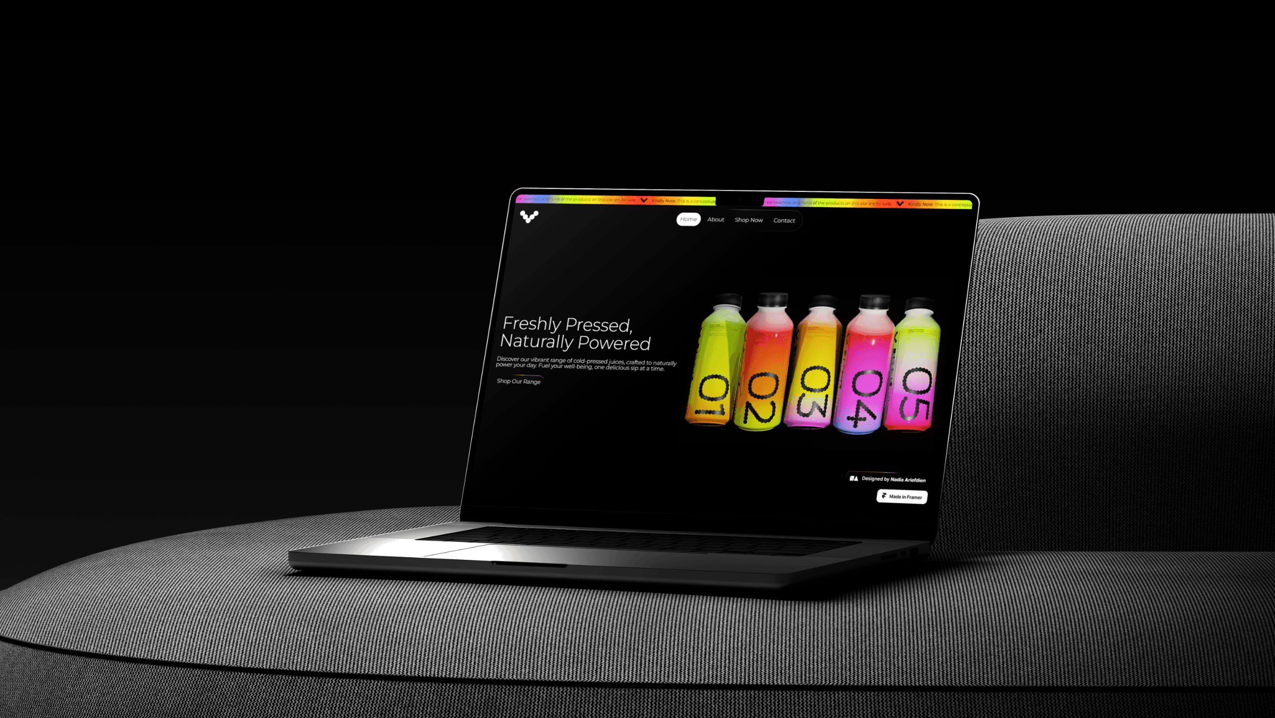
The Vitame website was designed as a natural extension of the brand identity. Built in Framer, the site features a sleek, minimalist layout brought to life through subtle animations and interactive details. Clean structure, intuitive navigation, and generous white space allow the content and visuals to breathe, while enhancing the overall user experience.
Every element was designed with responsiveness in mind, ensuring a seamless experience across desktop, tablet, and mobile devices. The result is a visually engaging, user-friendly website that captures the freshness, energy, and vitality of the Vitame brand — translating its visual language into a dynamic digital space.
INDUSTRY
Food & Drink
YEAR
2025
SERVICES
Branding, Packaging, & Web Design
LINKS
AWARDS & RECOGNITION
BRAAANDS – Brand of the Day (BOTD)
ILOVECREATIVES – Internet Gems (Featured)


THE BRIEF
Vitame offers cold-pressed juices made from real, nutrient-rich ingredients, meant to bring a little more energy and vitality into people's daily routines. The core ideas of the identity are nature, energy, simplicity, and health.
I knew early on that the identity needed to feel clean rather than crowded. Juice brands can lean hard into illustration and clutter with fruit everywhere, busy patterns, and loud typography. I wanted the opposite, and instead opted for bold simplicity.
FINDING THE MARK
Vitame has five signature flavors, so I started playing with five circles, arranged to form the letter V. Once the shapes locked into place, the mark did double duty: it referenced the flavor range and the brand name in one clean mark. The final mark is geometric, versatile, and instantly recognizable at a glance.
COLOR & TYPOGRAPHY
Black and white gave the brand a stark, confident foundation. But juice is alive, and the identity needed to feel that way too. So I built a rainbow spectrum of color on top, pulling inspiration straight from the produce itself — think bright citrus, beet, greens, and berries. Instead of flat blocks of color, I used smooth gradients that wrap around the packaging, giving each flavor a sense of movement rather than a static swatch.
The contrast between the strict monochrome system and those vivid, flowing gradients became the visual signature of the whole brand. It adds a boldness to an identity that is built on clean, simple design principles.
APPLYING THE SYSTEM
With the mark and palette locked, the rest of the system followed. Typography stayed clean and quiet, letting the color do the talking.
The packaging translated the colors into flavor-specific gradients, so customers can tell what they're drinking before they even read the label.
The website, built in Framer, carried that same restraint online, featuring lots of white space, subtle animation, and a layout that breathes rather than shouts. Every screen size got the same care, so the experience holds up whether someone's scrolling on their phone or browsing on desktop.
THE FINAL IDENTITY
This project left us with a final identity that felt bold, yet simple at the same time. The bright colors and stark contrast give the brand a sense of energy and authority without feeling cluttered.
It symbolizes fruit in a way that isn't done often. The brand expresses the fruitiness of its product through color instead of being obvious and direct.