CASE STUDY:
MAISON ÉLAN


SCROLL
PROJECT DETAILS
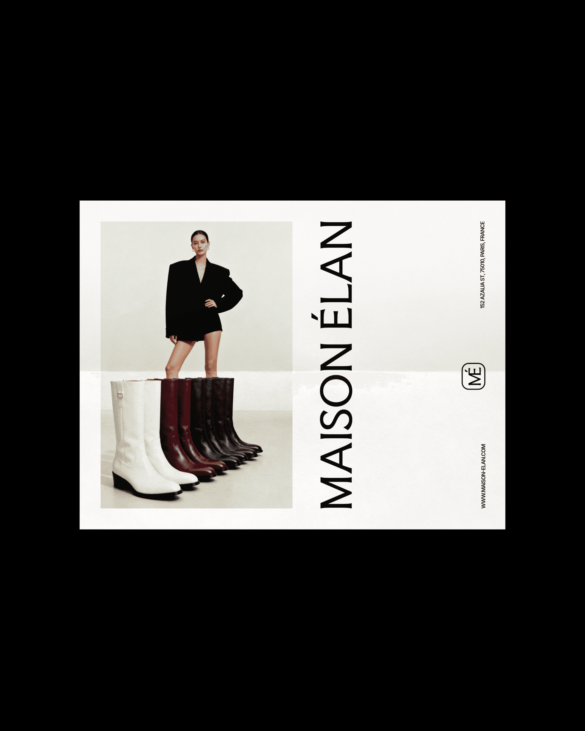
Maison Élan is a contemporary fashion label specializing in modern wardrobe essentials designed for longevity and versatility. The brand needed a visual identity that reflected confidence, simplicity, and editorial sophistication.
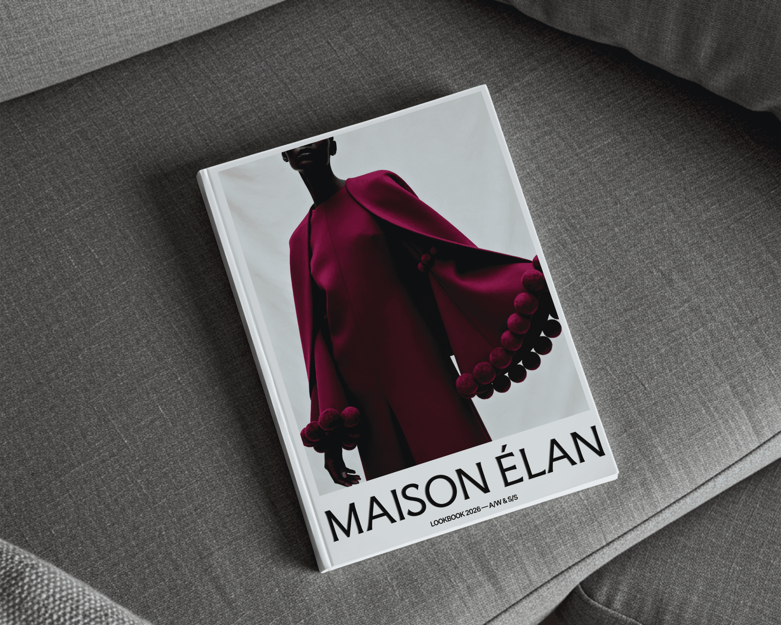
Maison Élan required a refined visual identity and seasonal lookbook design. The challenge was to create a system that balanced strong editorial influence with minimalist restraint.
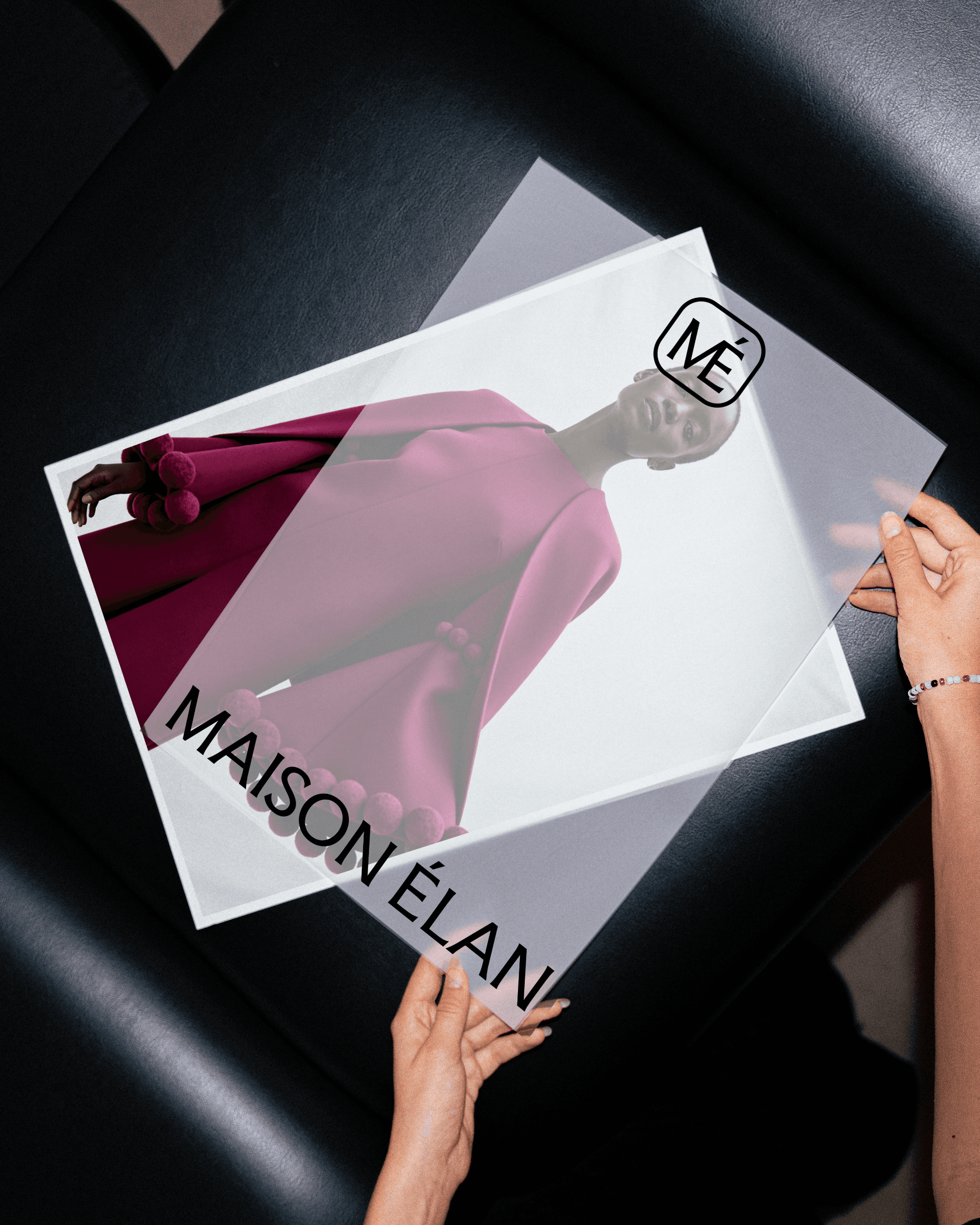
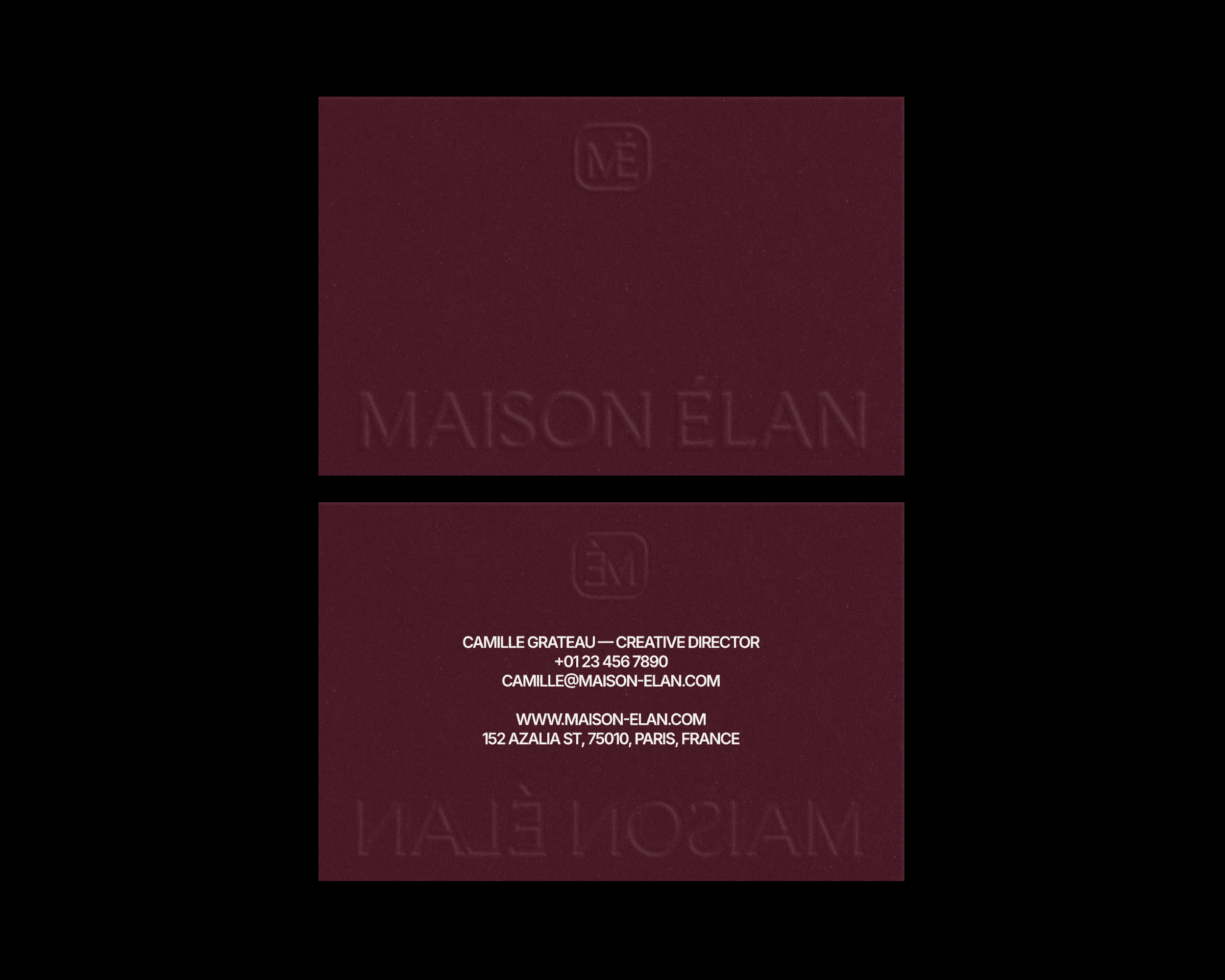
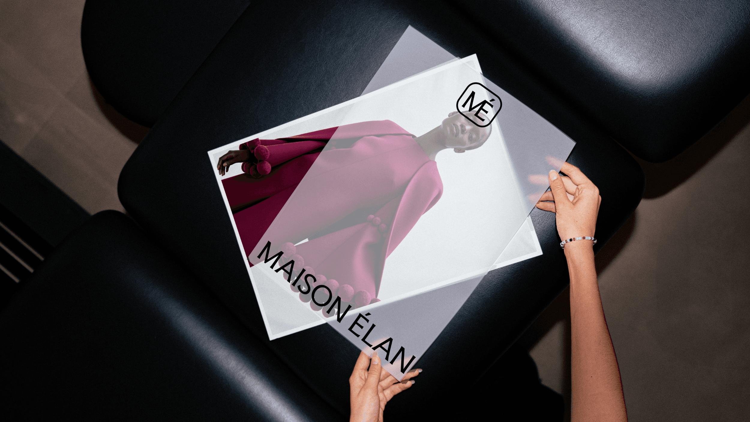
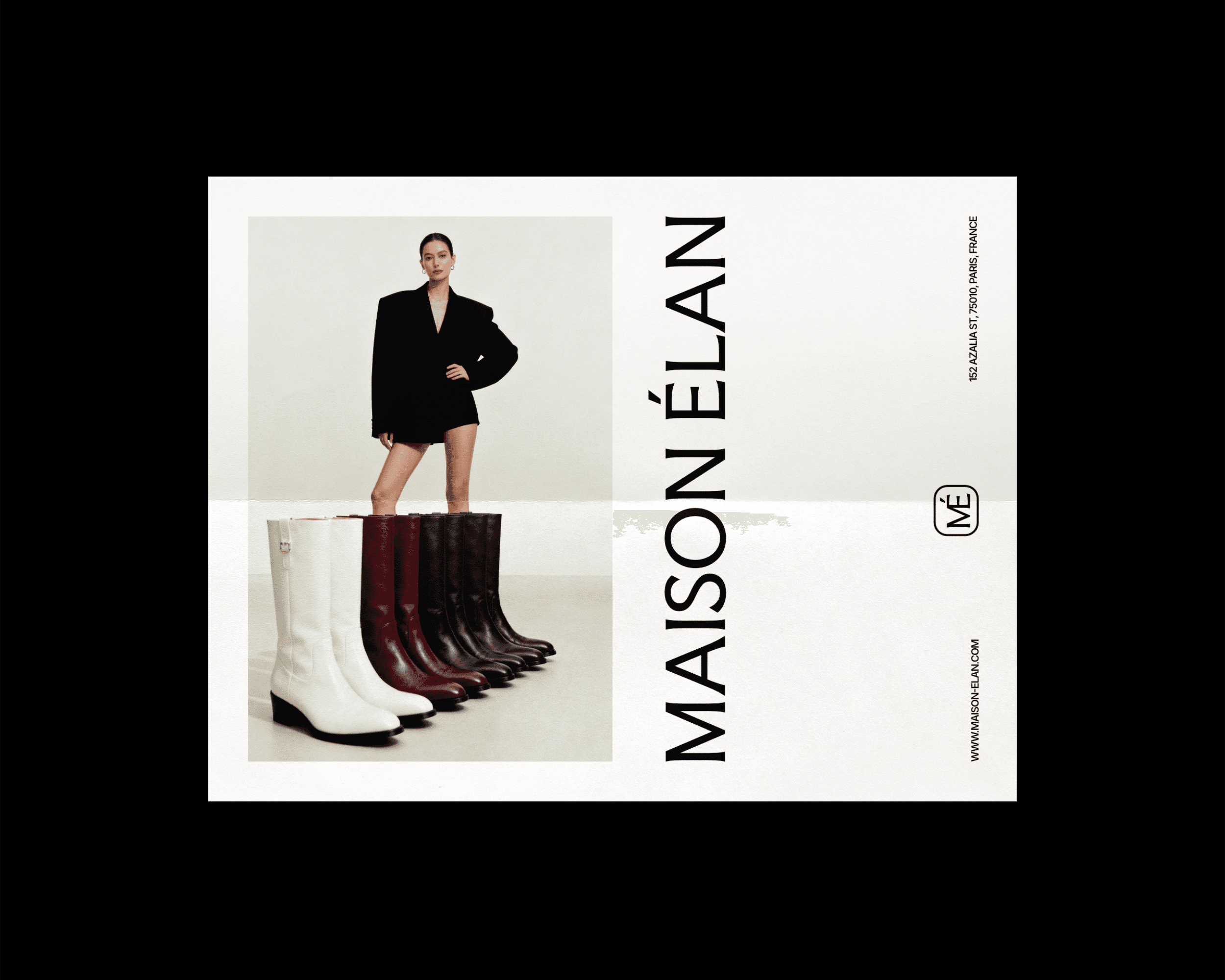
The identity system was designed to function seamlessly across digital and print applications, while the lookbook layout emphasised clean composition, expressive typography, and intentional use of whitespace.
The final outcome positioned the brand as modern and fashion-forward while maintaining timeless appeal.
INDUSTRY
Fashion
YEAR
2026
SERVICES
Branding

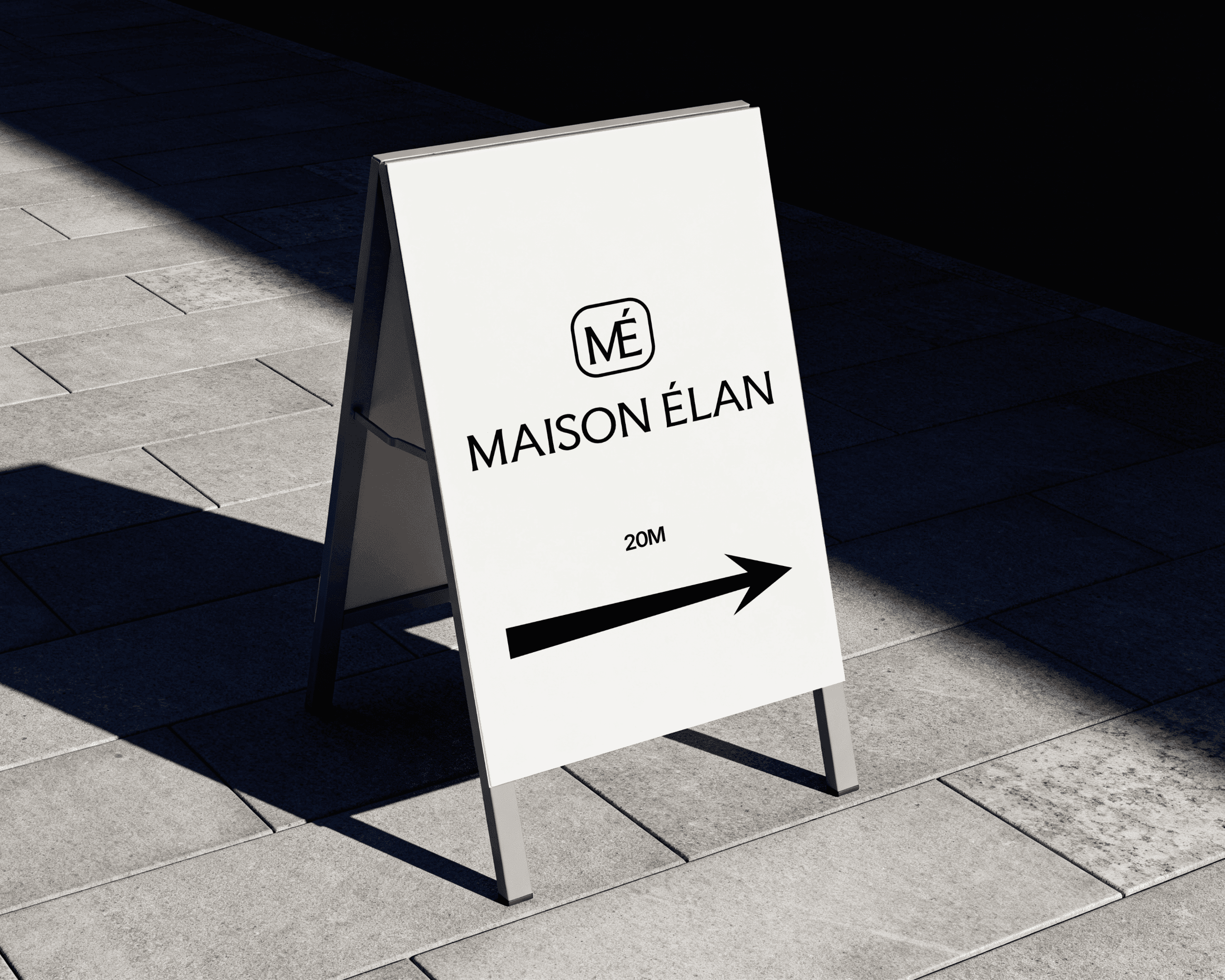
THE BRIEF
Maison Élan is a contemporary fashion label built around modern wardrobe essentials, offering pieces designed for a lifetime instead of just a season.
The challenge with a brand like this is that the identity has to carry the same conviction. You can't build a timeless fashion label on current trends and you can't communicate simplicity with a cluttered visual system. Everything had to be stripped back to what was essential.


THE LOGO
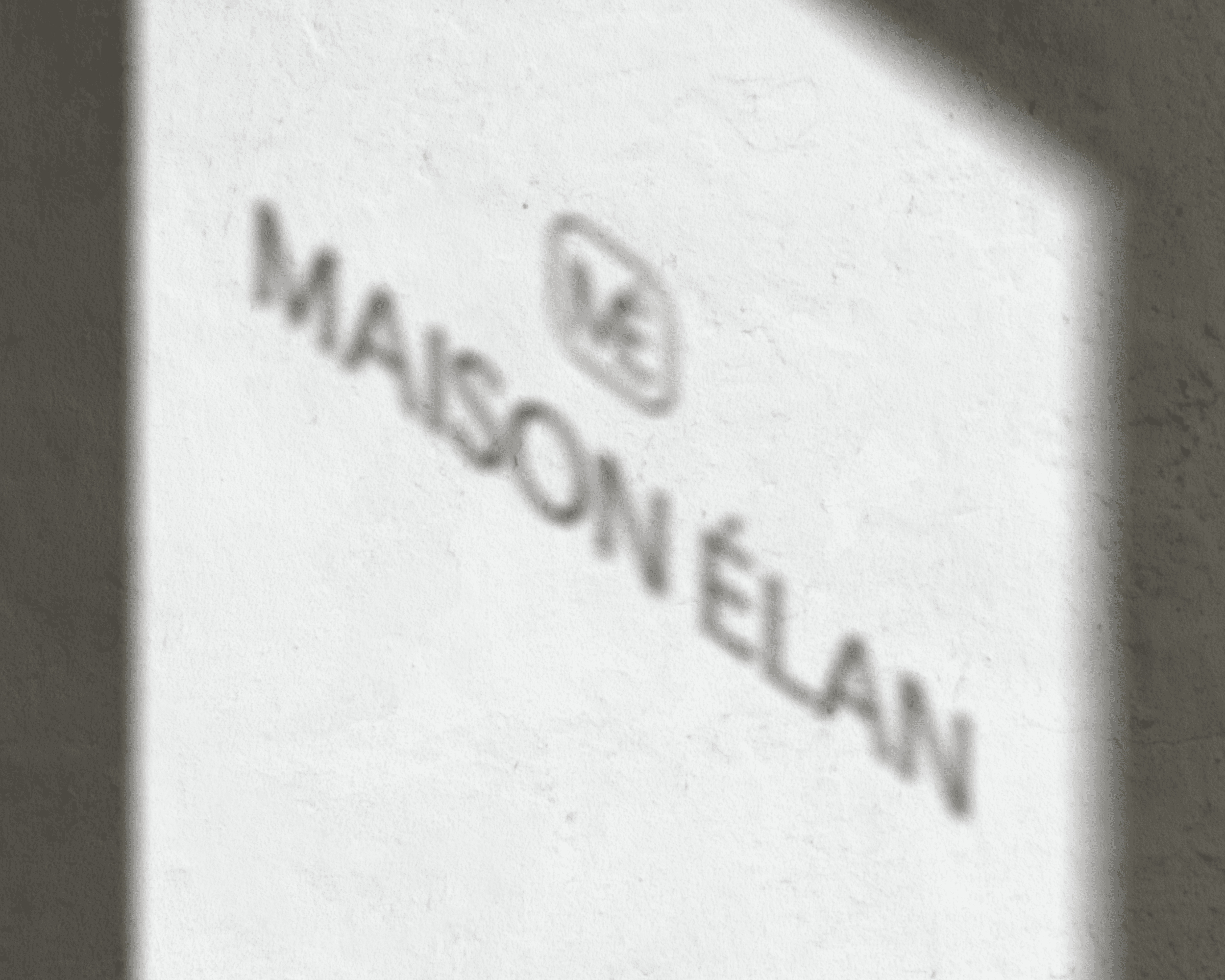
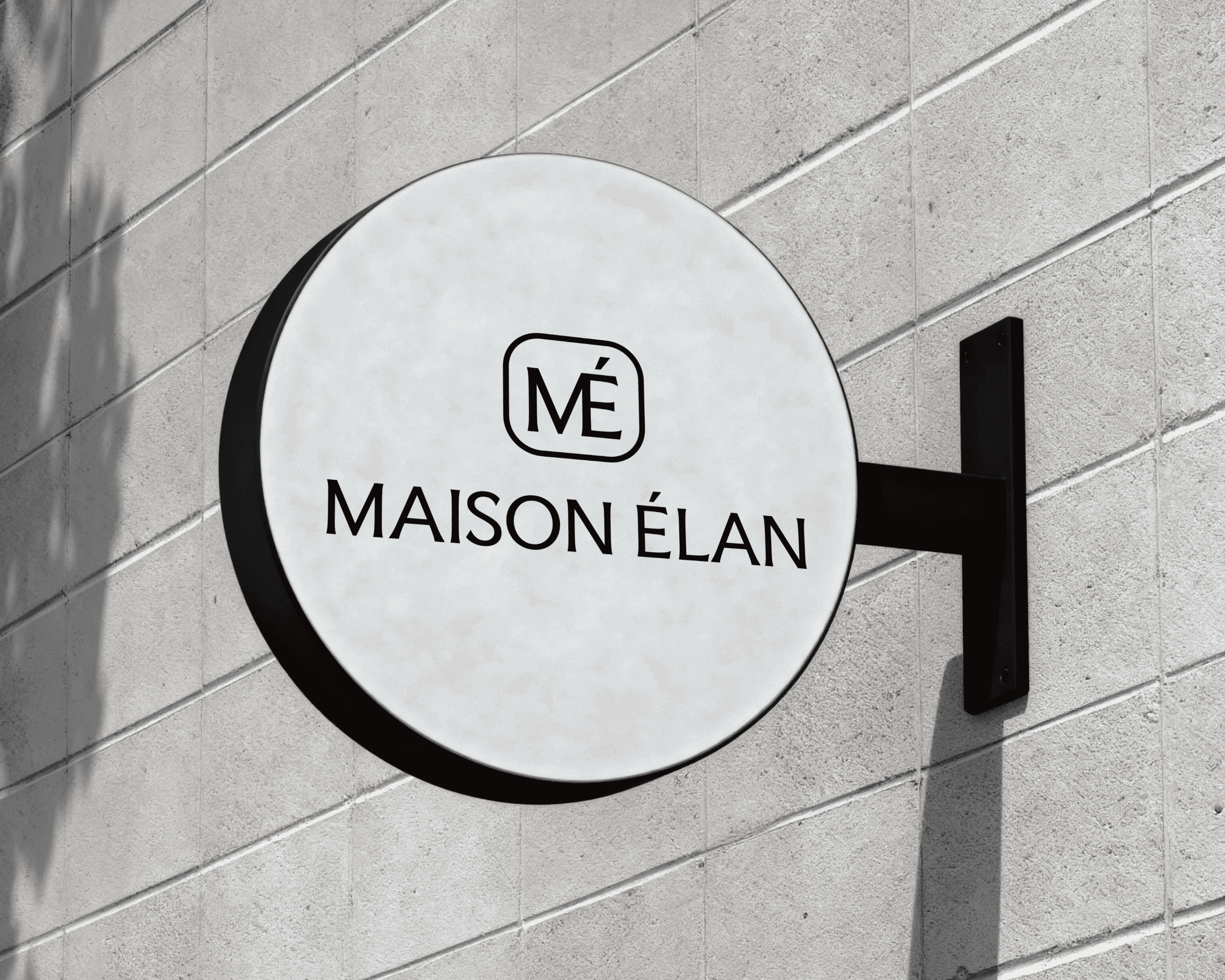
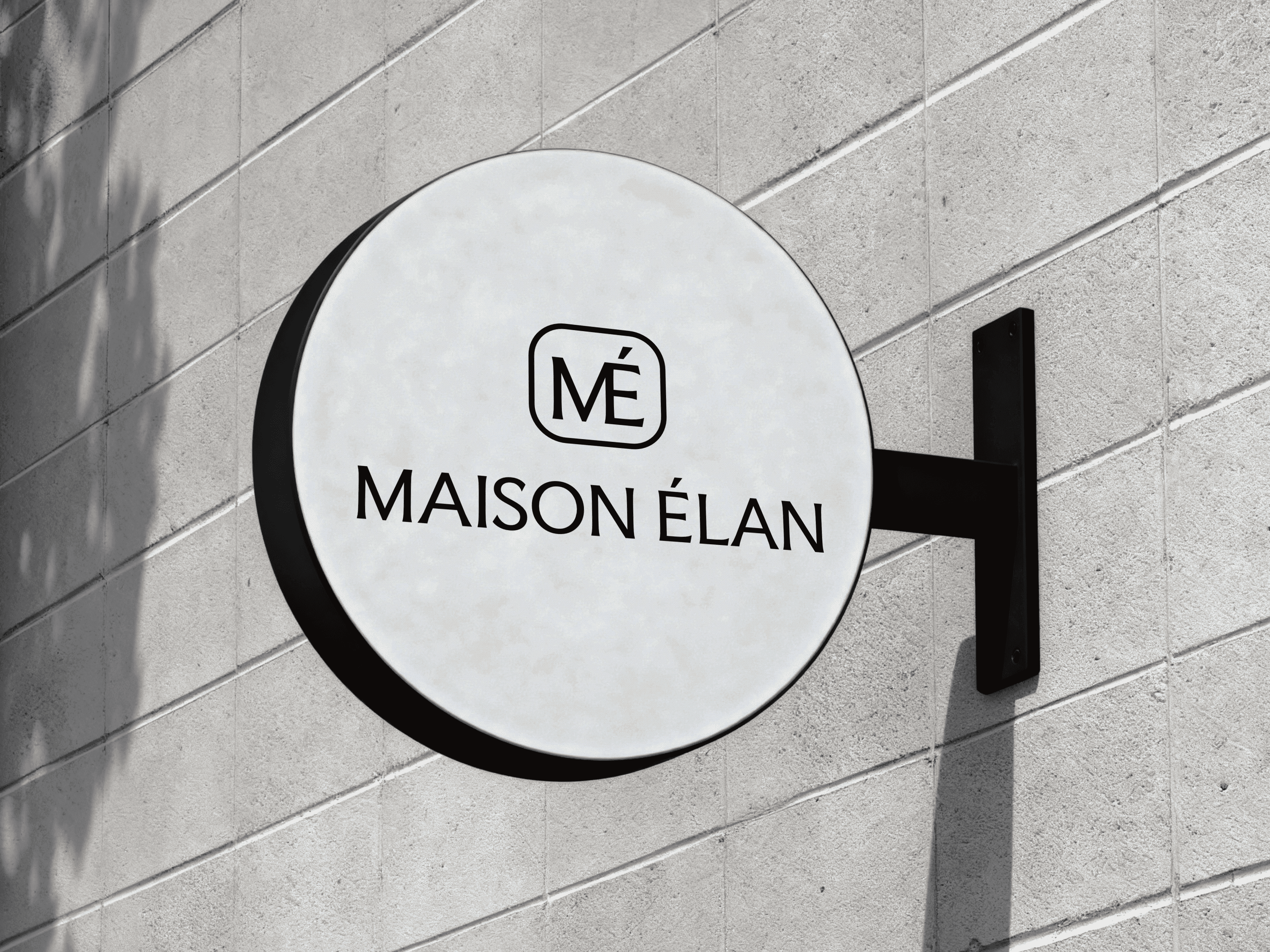
A monogram felt like the most authentic choice for the logo design. It's the visual language of luxury fashion houses, but executed well, it expresses lineage instead of imitation.
The final mark is clean, geometric, and confident and it holds at any scale.
COLOR & TYPOGRAPHY
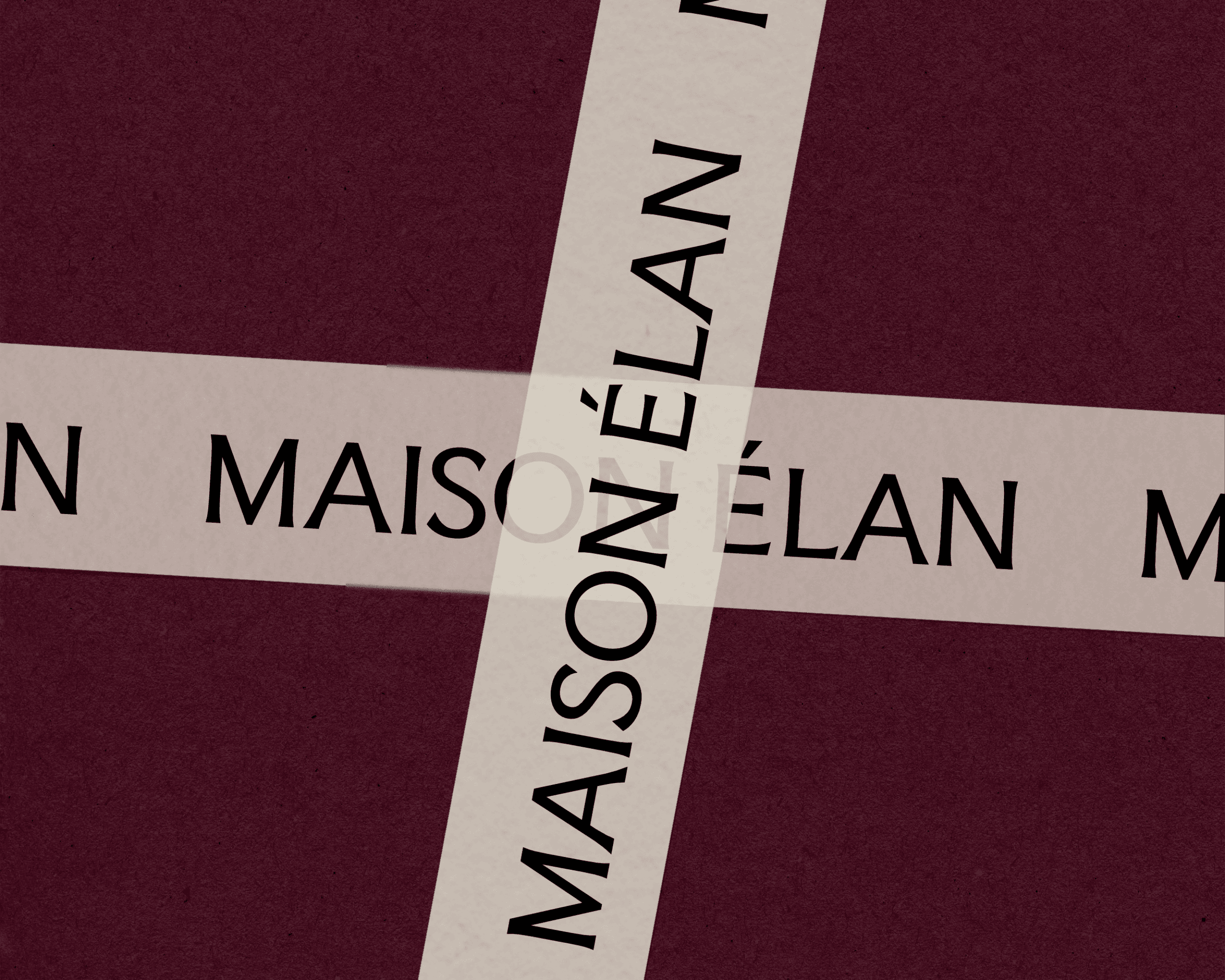
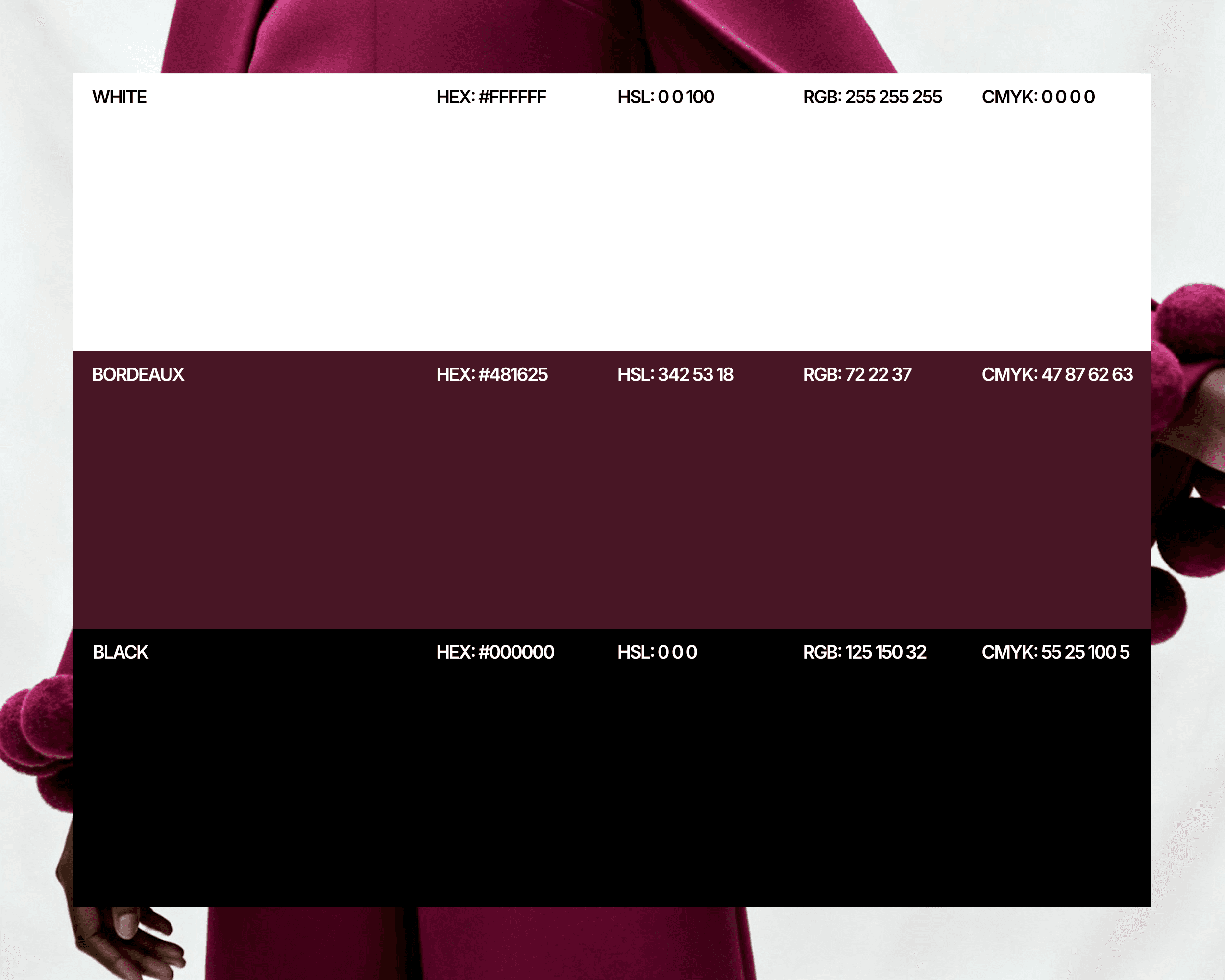
Black and white formed the base of the color palette for its timelessness and the authority it commands, especially in the fashion industry. But pure black and white can feel austere, even clinical. It needed warmth, depth, a touch of something unexpected. Burgundy was added as an editorial, regal accent. Used sparingly, it transforms a monochrome system into something with genuine character.
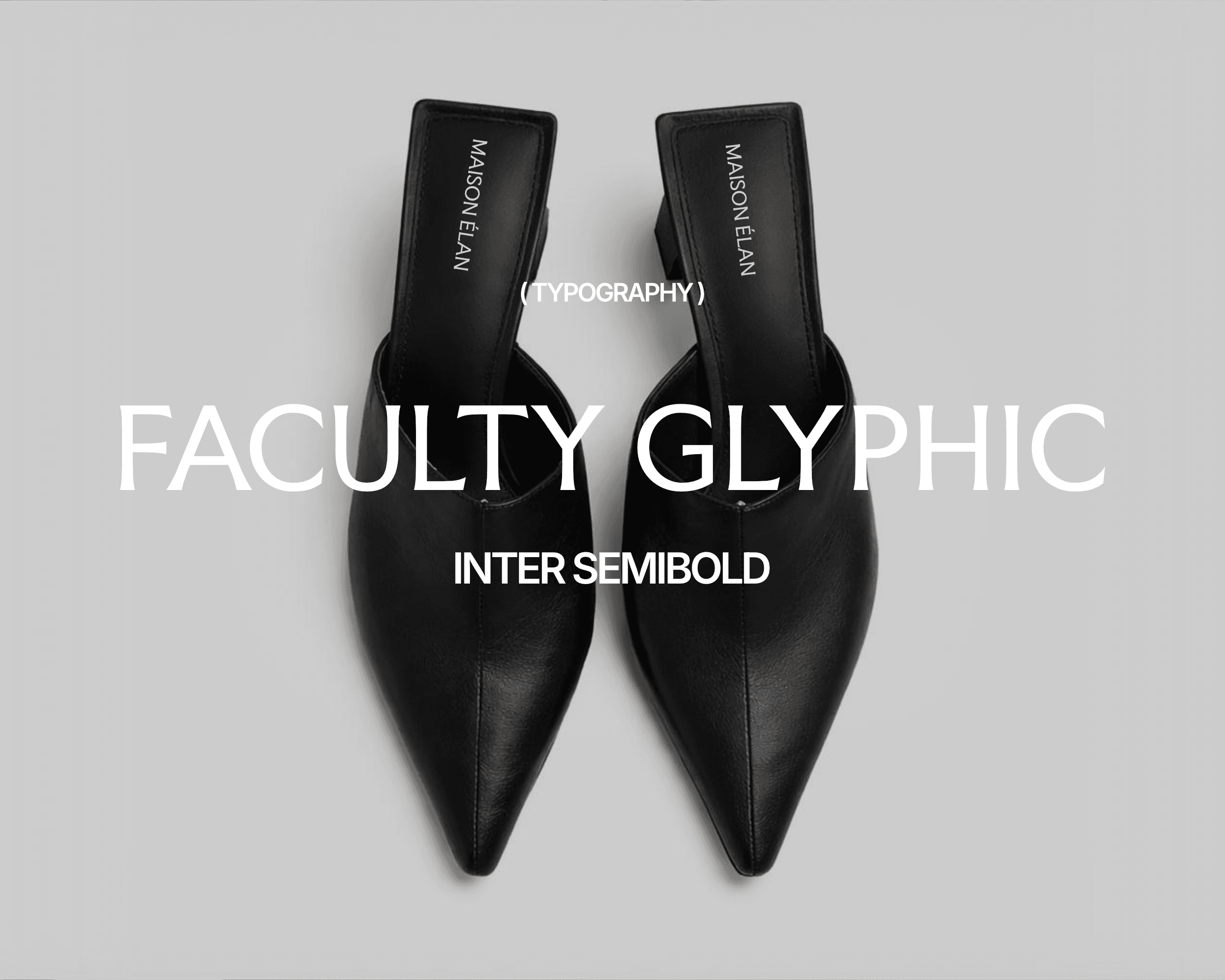
The typographic system was kept simple and clean. Faculty Glyphic became the primary typeface, used in the logo and headings. It's a serif-adjacent typeface family with enough range to carry editorial hierarchy without becoming decorative. Inter was used for body copy for its simplicity and versatility.
THE FINAL SYSTEM
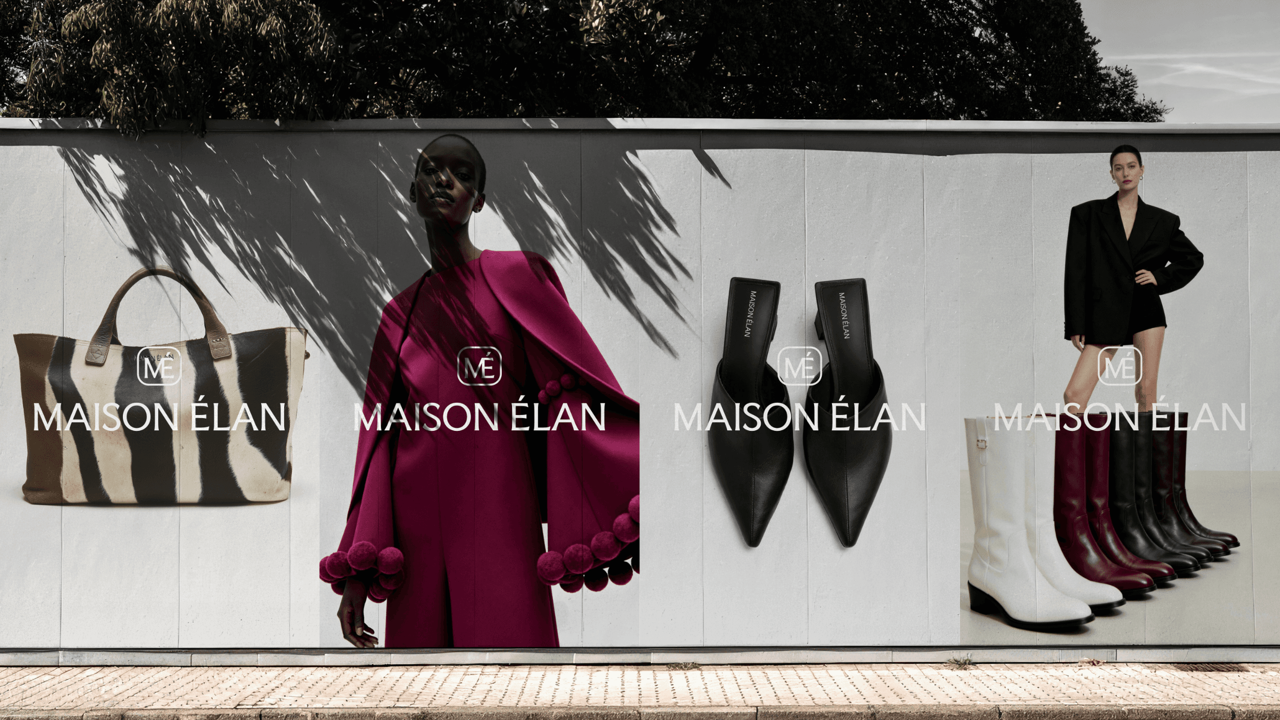
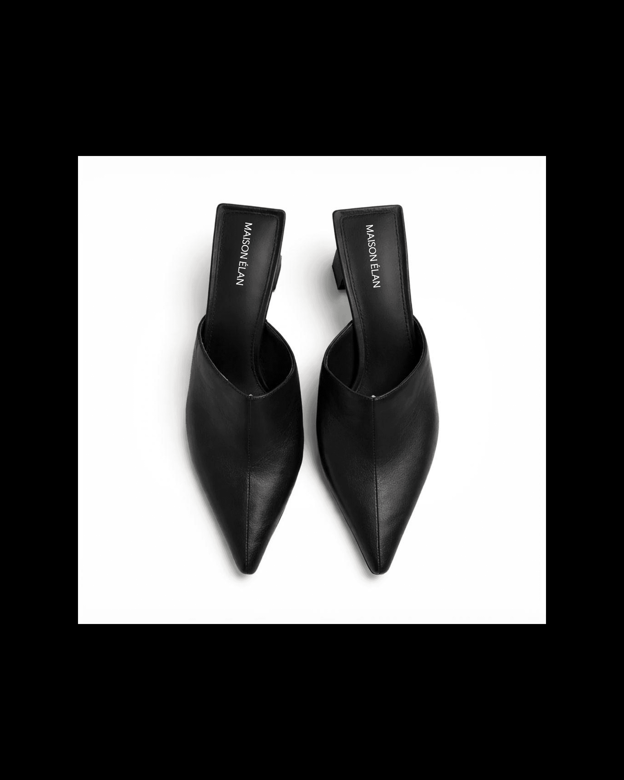
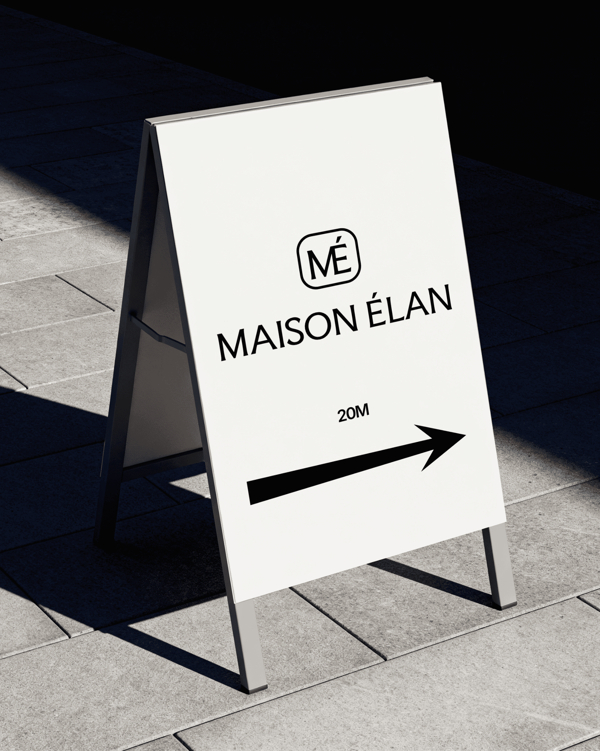
The finished identity system works across every surface Maison Élan needs it to — digital and print, and large and small formats. The logo scales, the palette is consistent, and the typographic system is simple and versatile enough to work across multiple seasons.